

What is a dashboard anyway? A more accurate description would be a digital information display but the term dashboard sounds much more “down to earth.” Still, it does warrant a description so that we’re on the same page.
I have crafted my definition taking cues from a few visualization experts and have included the what, who, how and why.
MY DEFINITION:
A dashboard is thoughtfully organized data on an interactive digital display to communicate its users’ objectives using best practices in data visualization.
So what?
So how does this definition translate to dashboard types? And why is this important? Dashboards have moved beyond just being a display for overviews or simple monitoring. They are used for so much more. Being able to identify the type of dashboard your client is describing will help you to better scope your project, manage your client’s expectations (they may not even be aware that there’s more than one type!) and select the right tools for your needs.
I have also looked at different data viz experts’ descriptions of dashboard types – usually there are three types but I’ve seen as many as 13! I’ve narrowed down these 13 types of dashboards into three main ones.
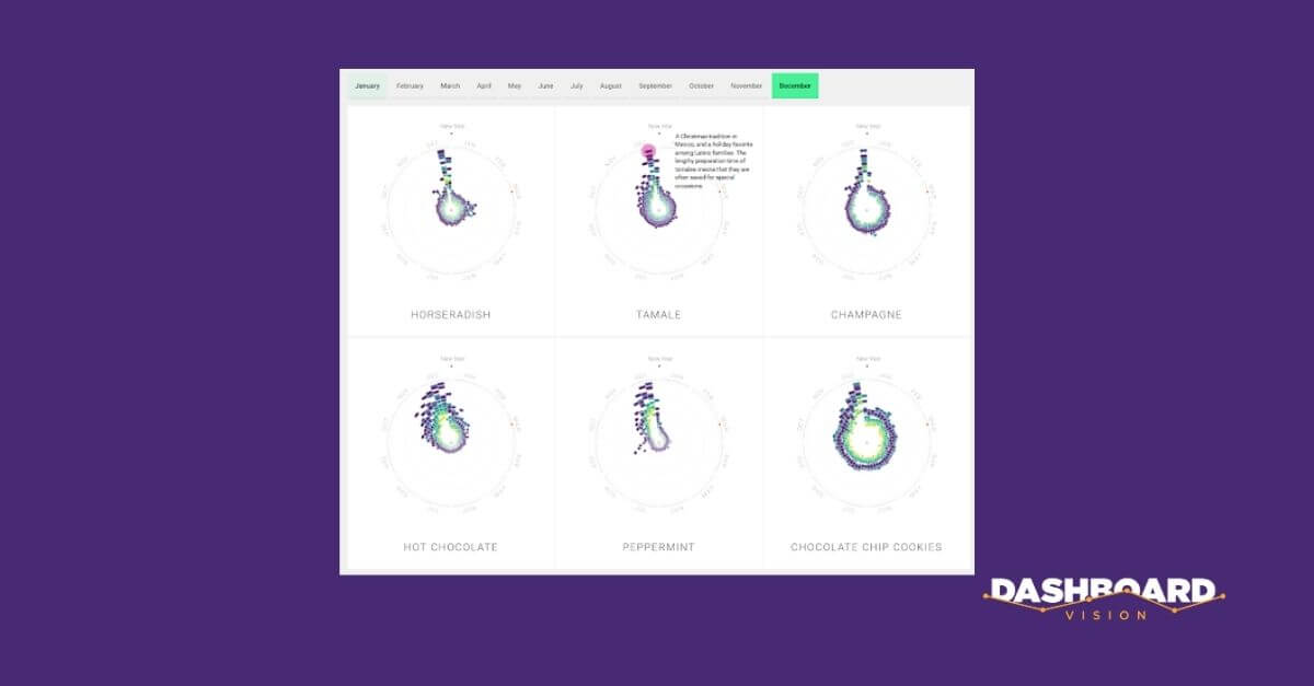
I’ll be using examples borrowed from Rhythm of Food, which is a series of graphics created by top data visualization experts. They not only make data interesting, but they’re also able to simplify it so that once you get your head around this one visual type it’s easy to understand. Even better, they make their visualizations fun (in my opinion) with animations.
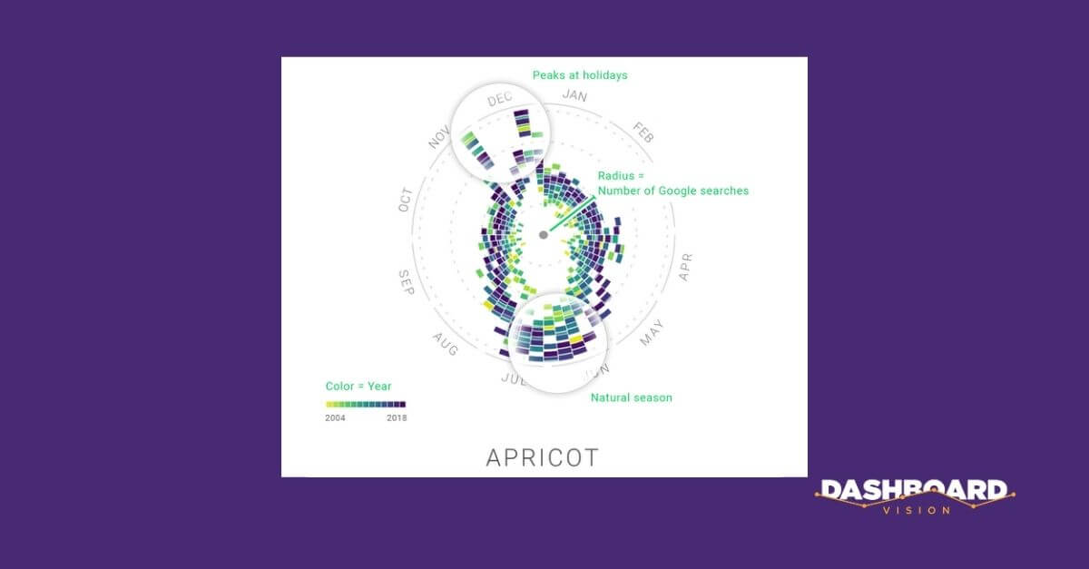
Let’s have a look. The visual used is a type of radial bar chart. It is more on the “complex and deeper” end of the visualization wheel (see my post Goldilocks & the 3 Graphs: The Visualization Wheel That Gets It Just Right), but is certainly appropriate since the data are cyclical, displaying trends year over year.
The example below is for the seasonality of apricot. The higher the Google searches for apricot, the further the bars extend to the edges of the circle. More searches are in November and December around the holidays as well as in the summer (not surprising!).
Let’s get into the three main types of dashboards now: Measure to Manage, Drill down to Discover and Tell a Story.
Measure to Manage Dashboards
Measure to manage dashboards contain measures that users want to monitor (e.g. KPIs) as well as context that answers “compared to what?” so that action (e.g. alerts) can be taken (or not). They are helpful when a business wants to monitor performance and ensure goals are being achieved. The example below wasn’t created specifically as an M2M dashboard (it would be one of a series of M2M dashboards supporting the business) but the premise to alert the manager to sought-after food items at different times of the year would aid in-store management and planning.
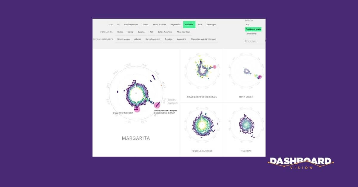
Drill-down to Discover Dashboards
These types of dashboards let users explore the data to find trends or specific patterns, or to investigate any alerts appearing on their M2M (measure to manage) dashboards. The exploration may unearth “nuggets of data” which can then be used in a presentation to tell a story.
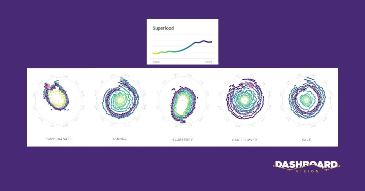
Tell-a-Story Dashboards
In conclusion…