

When I first saw this hovering ship, I thought I could write again about pre-attentive attributes, (see my blog on Graph Choice). But my further investigation into this hovering ship led me to the perfect illustration of pictures vs. drawings.
Let me explain. When I first saw the ship, I had no idea what was going on. Googling it, I saw that it is a picture of a “superior mirage”. OK, so what is a superior mirage? Looking at Google images, I saw again a bunch of pictures of ships etc. Then I saw it. It wasn’t a picture, but rather a drawing. So I quickly opened that page and saw the drawing below:
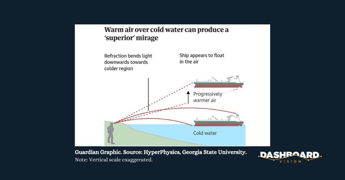
It explains pretty neatly how the light rays bend in the cold air. You look straight so you see the ship above and not where it should be. OK, makes sense. Now back to Alberto Cairo’s book, “The Functional Art” to see how I can apply this to data visualization. I re-read the passage about object recognition and there it was! From The Tell-Tale Brain (2011):
a sketch can be more effective because there is an attentional bottleneck in your brain. You can pay attention to only one aspect of an image or one entity at a time. In the dynamics of perception, one stable percept (perceives image) automatically excludes others. When you look at a full-colour picture your attention is distracted by the clutter of texture and other details of the image.” The sketch allows you to allocate all of your attentional resources to the outline, where the action is.
No wonder I made a beeline to the drawing so I could understand the superior mirage phenomenon! Here’s another example. Look at the picture of the ice hotel below from Alberto Cairo’s The Functional Art. Can you see the two very different types of visuals?
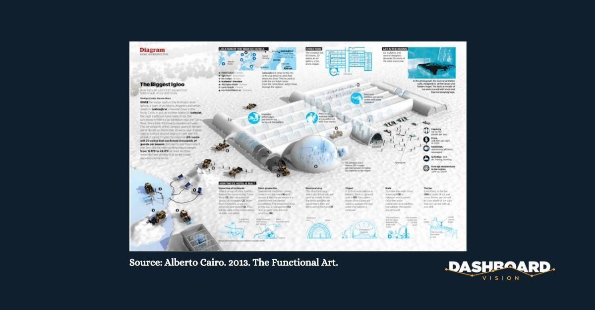
The “hyper-realistic” visual shows how the hotel looks whereas the drawings show how it works. The two visuals are nicely separated allowing you to view each in turn.
How can we apply this when we explain data to our clients? Well, for one thing, we sure don’t have to worry about “boring” our audience with simple bar graphs. Quite the opposite, it will be a relief. And, they’ll perceive your explanation much more easily as I did in the example above. So essentially, the simpler the better.
Not to say that you can’t use realistic pictures, but the point is to not use them in the same visual. There are hundreds of graphics to choose from, opting for the brain-friendly ones, keeping images or better yet, icons separate will help you achieve both your goals of a professional look as well as an effective presentation.

Marya Kaska is the co-founder of Dashboard Vision. The company will soon release its new data-to-insights reporting platform helping users take full advantage of powerful business intelligence and PowerPoint solutions.
Follow her on LinkedIn.
Email: mk@dashboardvision.com.