
“Effective information visualization is built on an understanding of how we see and think.”
– STEPHEN FEW
NOW YOU SEE IT: SIMPLE VISUALIZATION TECHNIQUES FOR QUANTITATIVE ANALYSIS
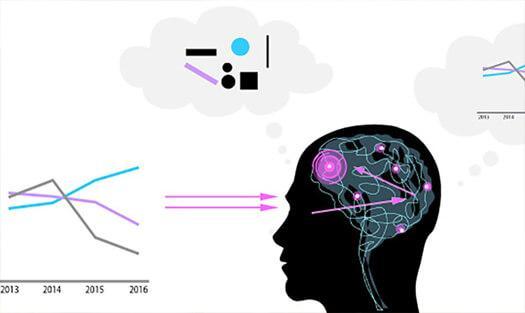
My last blog mentioned creating graphs that facilitate our ability to grasp information pre-attentively. In other words, the understanding of information prior to being aware of it. This is what the quote above by Stephen Few is referring to. In this post, I’ll provide a few examples of what this means.
Many people say “I’m a visual person.” This isn’t surprising since of our five senses, vision dominates our perception of the world. Vision researchers have known for many years that certain visual attributes such as hue, length, width and motion are detected quickly by our low level visual system without us even thinking about it. The fact that you can see the red dot immediately in the picture on the left (an example of hue) is a case in point of this pre-attentive ability.

Now notice when you try to show the red circle with distractions of other colours and shapes? Hard to see it? I would agree.

This simple example shows why it’s critical to make your visuals easy to read. Anyone forced to spend extra time looking closely at the visual nuances of graphs to understand the point of the author will quickly lose patience and end up being frustrated. Not exactly what you want a customer or prospect to feel.
Let’s take a look at an example of a graph which does not capitalize on our pre-attentive abilities on the left and one that does on the right. This spider or radar graph is meant to describe progress of a particular bank on managing its ID fraud. Can you tell if there is a difference between Prevention and Investigation? I can’t without zooming in to count the gridlines or using the scale numbers. Clearly the bar chart on the right is the way to go. It easily shows the status of the different stages.

Adapted from Storytellingwithdata.com
The spider graph may look fancier or different from the common bar chart and you may be tempted to use it to break up the monotony of your presentation. But if you have a compelling story, your data clearly represented in the bar chart will sell itself.
Do you have questions or other examples that you can provide on graphs or charts that create pre-attentive awareness? Please share. And as always, feel free to send me a chart that you’re struggling with and I’d be happy to provide you with input on how to improve it. Just email me at mk@dashboardvision.com.