

It was pretty easy for little Goldi to figure out the bed that was “just right” by sitting on it. When we evaluate our visualizations, though, we need a little more than just “gut feel”’ Luckily, there is a handy visual for you to get it “just right”.
Think back to a dashboard or graphic you recently created and now take a look at this visualization wheel taken from Alberto Cairo’s book “The Functional Art”:
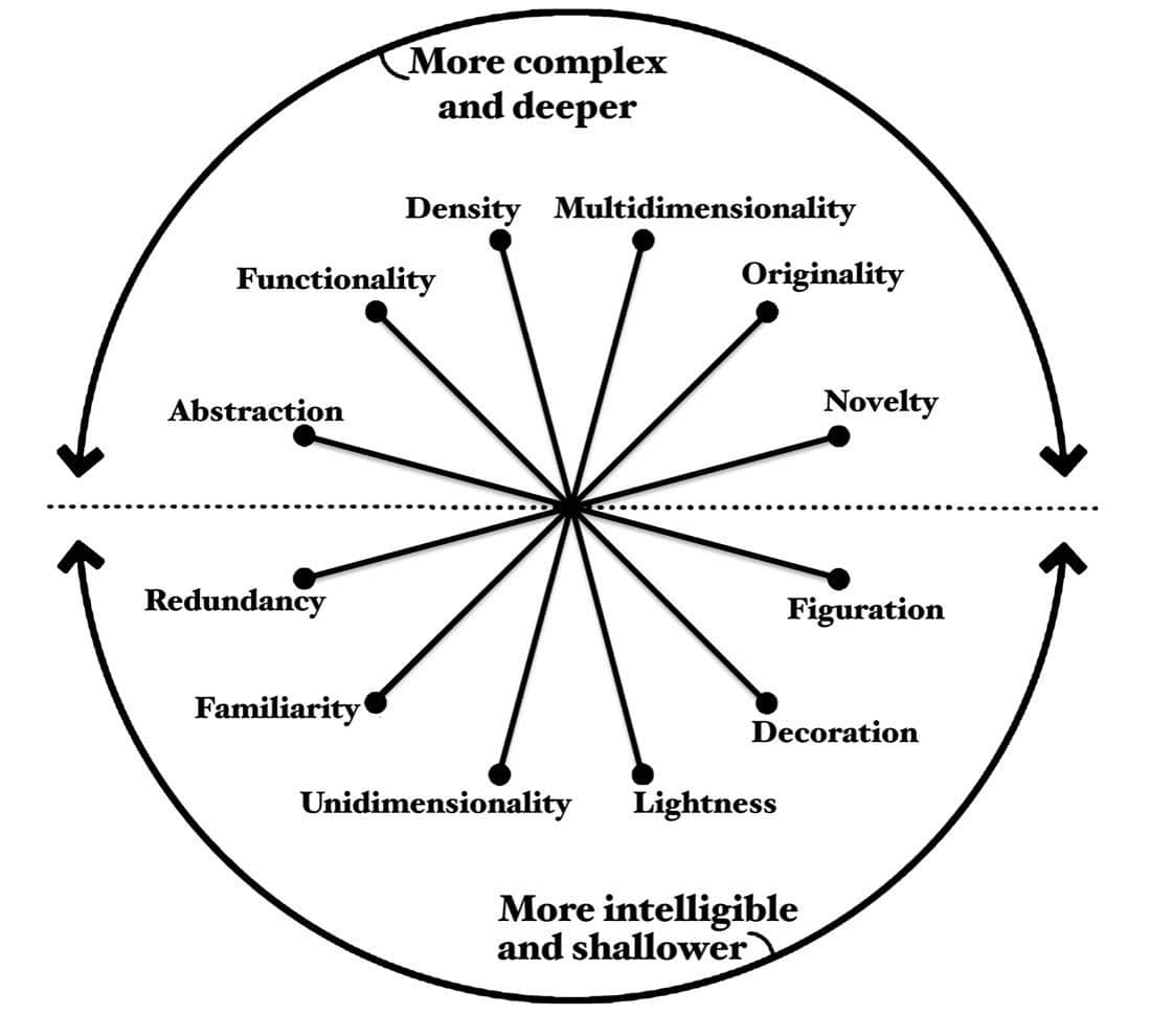
The endpoint of each line represents the extreme of each factor. Mark where you think your visualization lies on the continuum and fill it in. For example: is there more function or more decoration? The result will be a filled radar chart illustrating to yourself and to your customer how complex, how detailed, or how simple your design is.
When I first saw this I realized how important such a visualization wheel is. As information designers, we often receive vague and sometimes negative feedback from customers. This results in frustration all around. The designer doesn’t know how to interpret the feedback and the customer can’t clearly express why.
The wheel helps both parties. It gives the customer clearer language with which to describe their perception of the visual(s). Rather than “it’s ugly”, they can say “it’s more functional”. Rather than “unfriendly”, they can say “it’s more novel”. The designer can then work with the customer to discuss why the design was chosen. Using the wheel they can come to a compromise on what to change. If we can agree on a common language, as described in the wheel, we can then aim our designs to match:
- The content we are trying to display
- How knowledgeable our audience is about the content
- How savvy they are about graphs in general
For more data visualization insights check out our blog where we write about best practices in PowerPoint and Dashboard reporting.