

“Begin with the end in mind”– Stephen Covey’s Habit 2 sums up the first station of our circuit. But let’s delve deeper into what this means for a dashboard designer.
Think about the beginning. You have data. You have a plan for that data and you know who will read it – more or less. Maybe you even have a few designs in mind… Stop! Do this first. Write down the answers to these questions:
- What data do you want to show? What story do you want to tell?
- How do you want your audience to interpret these data? How will it be useful for them?
- What will your audience be able to do with the data?
The better you can define what your goals are, the easier it is to choose a graph type. Don’t make the mistake of choosing the design first. The graph elements should be chosen, first and foremost, based on how they help the reader understand the message. Let’s look at an example.
Below is a graph I spotted on visualcapitalist.com.
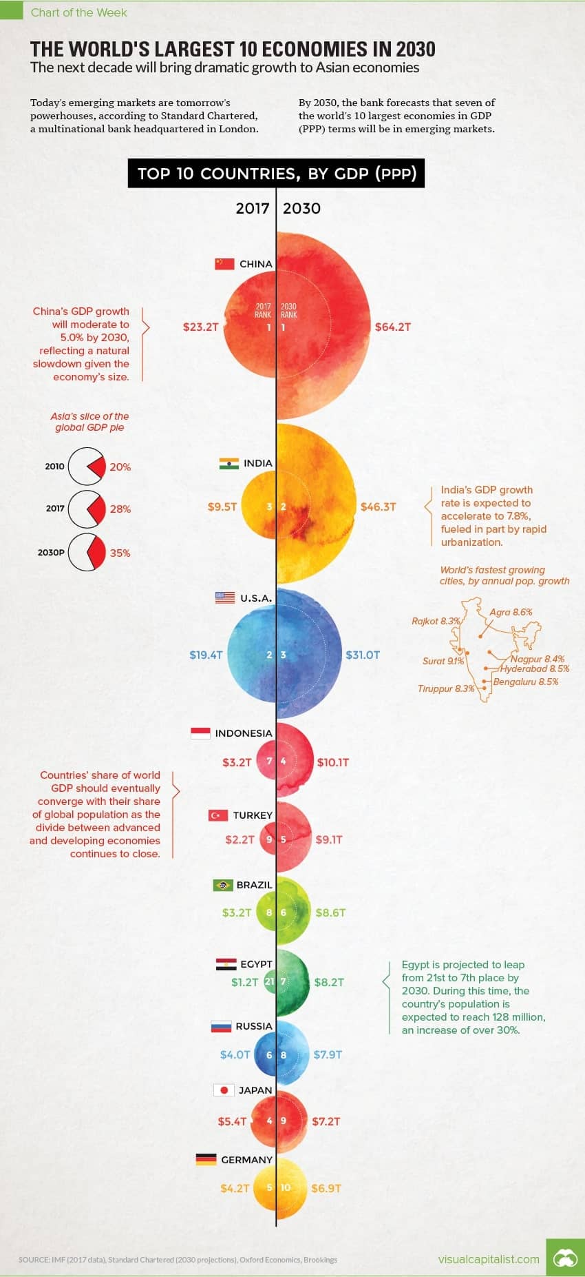
If we use our questions above, we know that we have:
2 years of GDP (PPP) figures ranked for each year. Judging from the text in the article, the aim is to show the change over this time period, particularly in Asian economies and then presumably show which ones.
So now take a look at how the designer chose to illustrate the goal of the graphic? Can you tell:
1) How much Asian countries will grow compared to ROW?
2) Which countries will grow the most in terms of GDP from 2017 to 2030?
3) Which countries will remain the same or decrease?
I find it hard to answer these questions easily. I can see from the title (which I didn’t notice at first) and then looking at the numbers and the decreasing circumference of the circles that the column of half circles on the right is sorted from highest GDP to lowest. Now I have to look at the 2017 column and try to find where it is the highest. I look at the half circles and try to compare them but since they look so similar I give up and focus on the numbers. Looking at each pair of numbers, on the left and the right, I try to judge which one has the biggest change.
By this time most readers would give up. It’s too much effort. The design, with its brightly colored moons and half moons, does help to invite the reader in but fails the key purpose – to promote understanding.
A simple slope graph similar to the one below would easily depict the differences in ranks and by highlighting the Asian countries, the reader would be able to quickly see the point the author is trying to make.
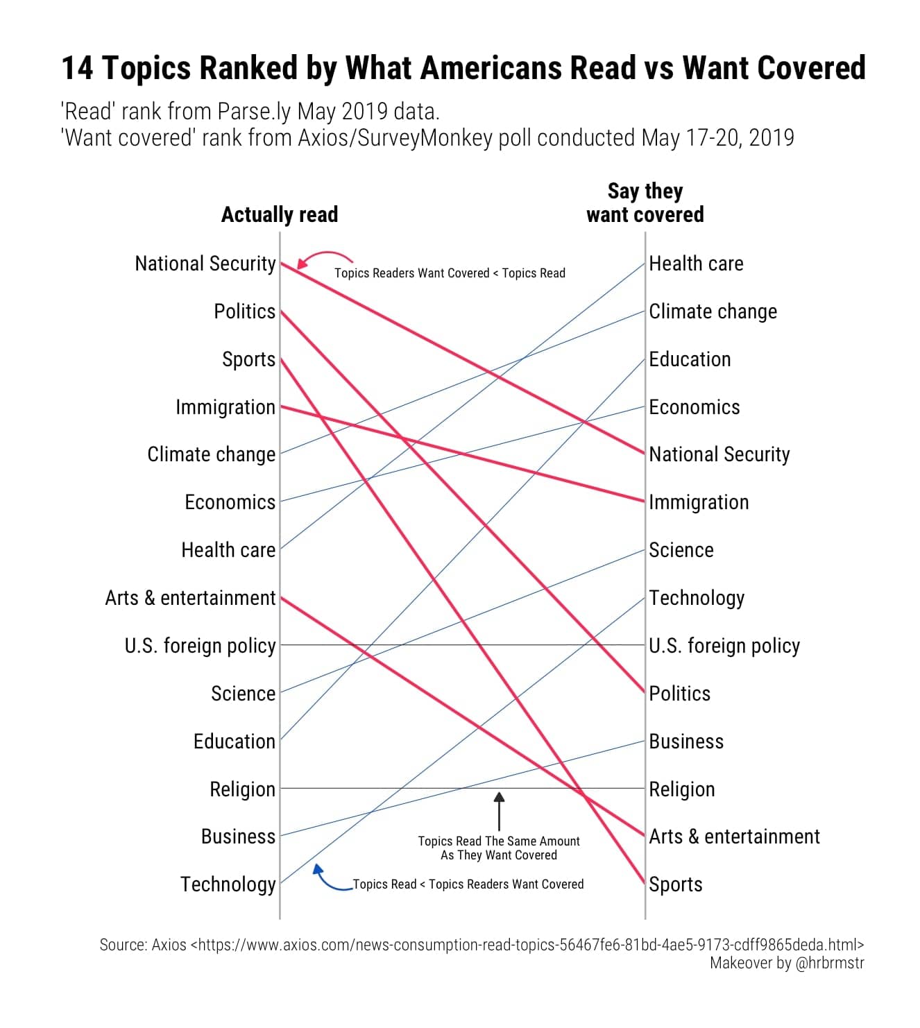
Is this graph any less inviting than the moons? I think not, but that’s a different blog post where we cover how you can make your design interest your audience without undermining the story you want to tell.