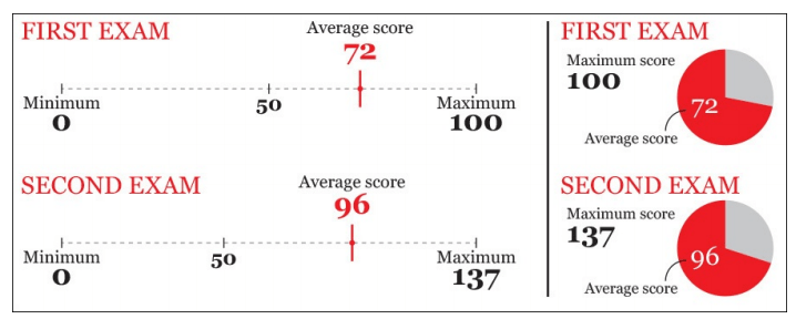
The Importance of Graph Choice in Dashboard Design
blog14

In our previous blog article we discussed the importance of knowing your audience and asking the key questions before jumping into design. Now I want to focus on how to use the answers to these questions in graph choice.

When choosing visuals for our presentations, one of the most important things to consider is accuracy. Interestingly, the human brain is more able to detect differences and make comparisons viewing certain types of graphs but less so in others, so choosing the right ones that match our purpose can make a big difference.

Let’s take a look at the graphic below from Alberto Cairo’s “The Functional Art”. 

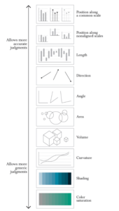
The graphs at the top of the scale help the audience to discern subtle differences in the data in order to understand the message, the graphs toward the bottom give the audience more of a high-level overview. 


This doesn’t mean you can only restrict yourself to certain graph types. It means that you need to consider how precisely you want your reader to interpret the data you are showing and present them with a graph that allows them to do that easily. 

Let’s look at this example, taken from Alberto Cairo’s “The Truthful Art”. 

Students preferred the 137 maximum point scoring system to the one out of 100. In the former scoring system (with 137 maximum points) their average score was 96, much higher than the 72 average score from the out of 100 scoring system. However, as is clear by the visual below with the 96 average score appearing to the left of 72, 96 equates to a 70%  score, making their average score lower. 

The pie charts to the right cannot show this difference easily since from the diagram above, we can see that the “angle” is lower on the list. Thus the visual on the left is much more effective than the pie graphs.

So when you are at the point in your design to decide which graph to use, accuracy should play an important factor in your choice. And you can refer to the handy scale above.

For more examples of graph choice and other data viz articles, take a look at this post about funnel and donut charts!